

Product
LiveSorrel
A symptom checker for phone and web: it turns how you feel into one clear next step and the right care nearby, and never calls a result a diagnosis.
Facts
- Status
- Live
- Platform
- Phone app · web app
- Flows
- Symptoms · Results · Care · Records
- Model
- sr-triage 4.2
- Safeguards
- Emergency check first · never a diagnosis
- Year
- 2026
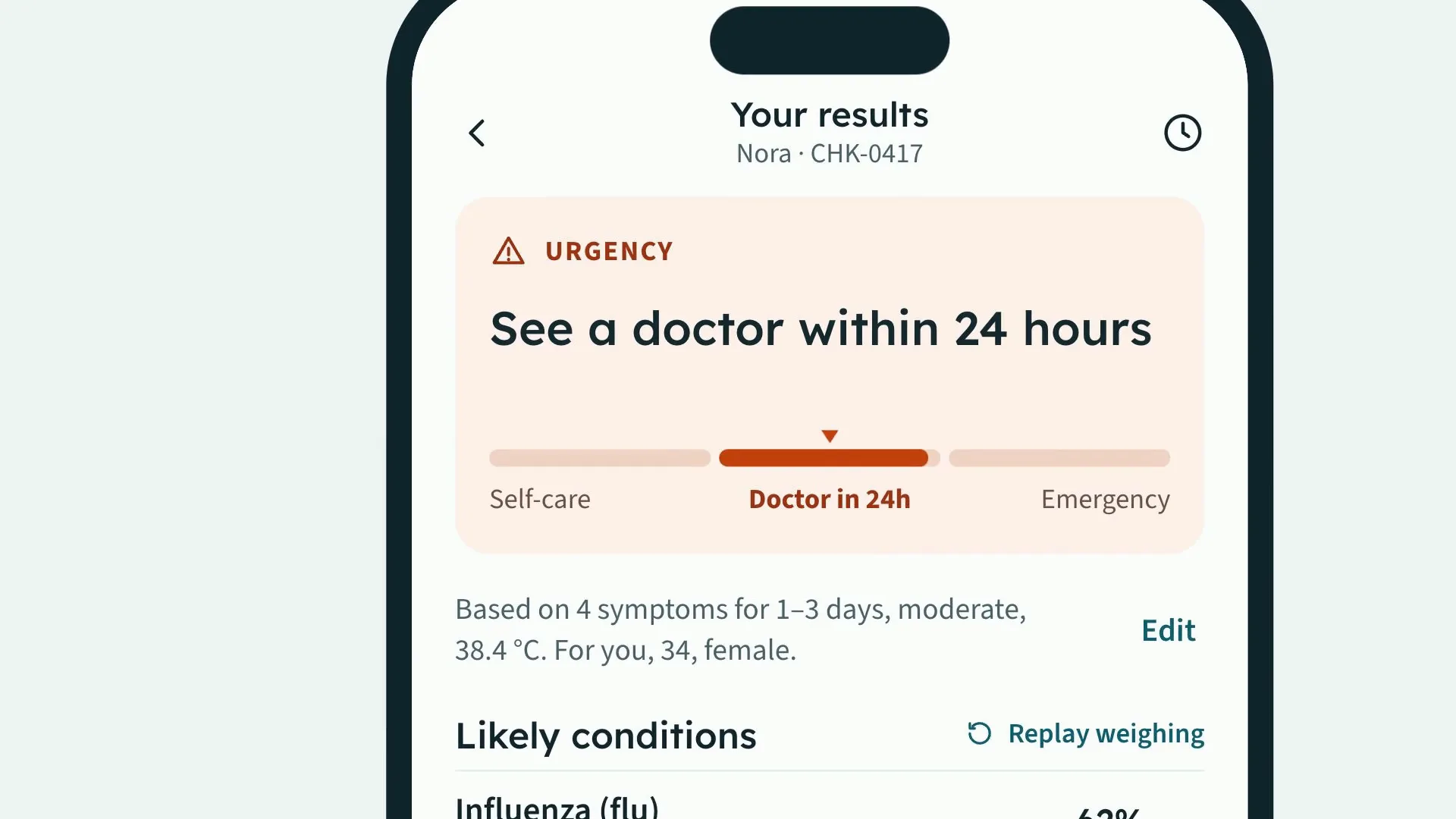
FIG. 01 / PRODUCT FILM
Muted preview · play with sound for the full cut
Who it's for
People deciding whether what they feel needs care today, for themselves or for someone in the family they check for, such as a child with a fever. The phone is for the check itself; the web app is for keeping the family's checks at a desk and preparing for a visit to the GP.
The problem
Searching symptoms online returns long lists of possible illnesses and no sense of how urgent any of them is. The questions that matter — do I need care today, where can I go, what do I tell the doctor — are left to you, and at the appointment you describe it all again from memory.
The product
You add what you feel and answer five emergency questions before any result appears — a yes to any of them tells you to get emergency care now — then Sorrel's triage model, sr-triage 4.2, weighs your answers in view and shows the urgency first, with its reasons, before the likely conditions as relative likelihoods, each with the evidence for and against it. It then finds care nearby that fits that urgency, with waits and a route, and prepares a one-page summary for your GP, with you choosing what it includes and seeing when the practice opens it. Sorrel does not diagnose, and every result says so. In an emergency, call 112.
FIG. 02 / HOW IT WORKS
How it works
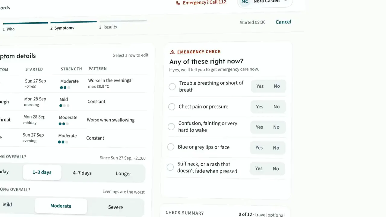
Step 1: Symptoms
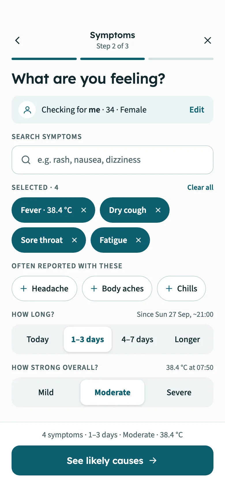
Search for what you feel or browse by body area, and each symptom is placed in the tray; set how long and how strongly, and add a temperature, medication or a note. Before any result, five emergency questions come first — trouble breathing, chest pain, confusion, blue lips, a stiff neck or a rash that doesn't fade. A yes to any of them skips the results and says to get emergency care now.
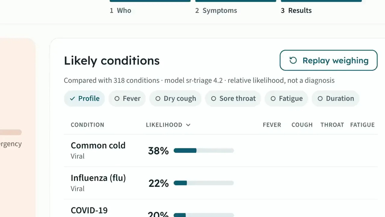
Step 2: Results
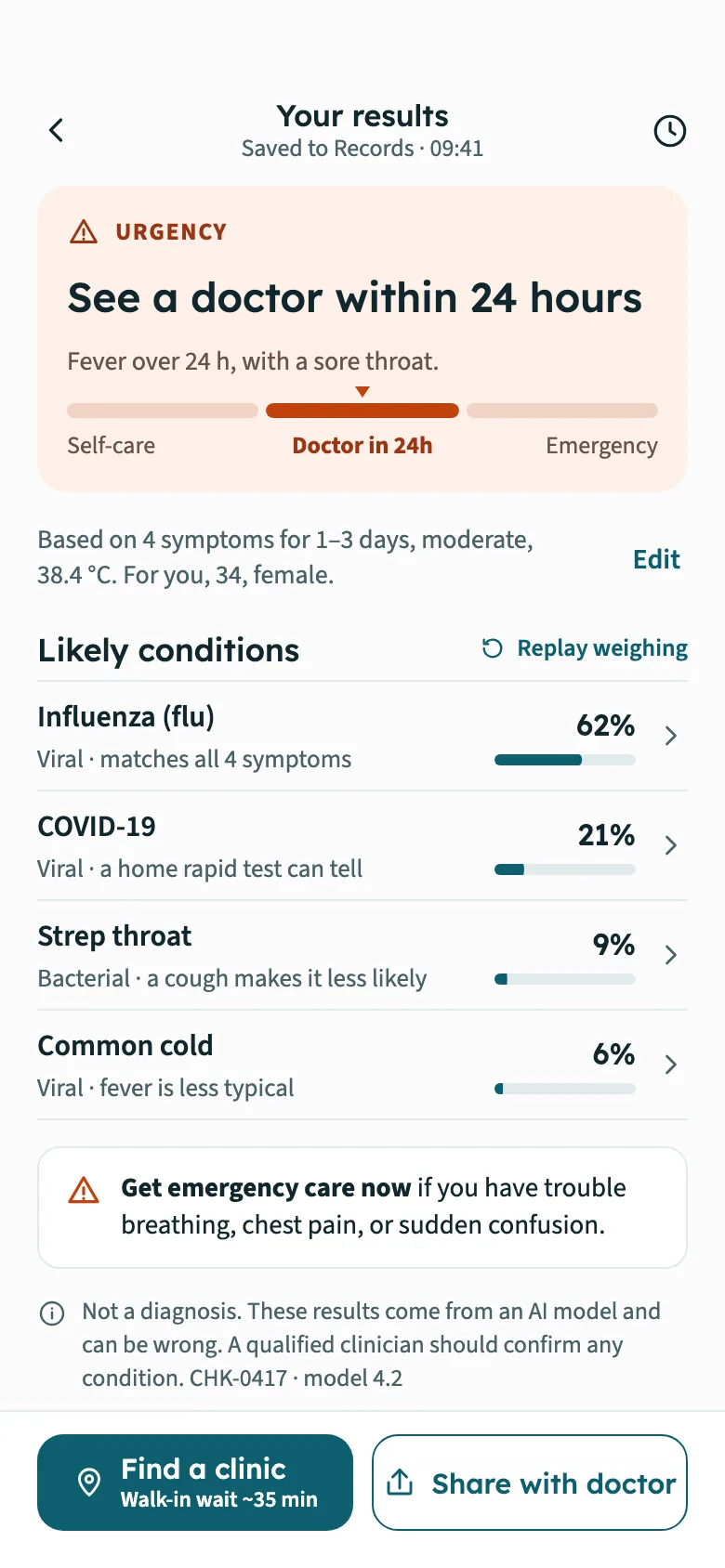
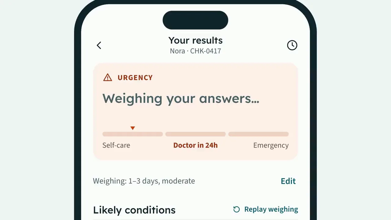
Sorrel weighs your answers one at a time, in view: each symptom nudges the likelihood bars, and the ranking settles once. Urgency comes first — self-care, a doctor within 24 hours, or emergency — with the reasons for the level. Every likely condition shows the evidence for and against it and an 80% range, and every result says plainly that it is not a diagnosis.
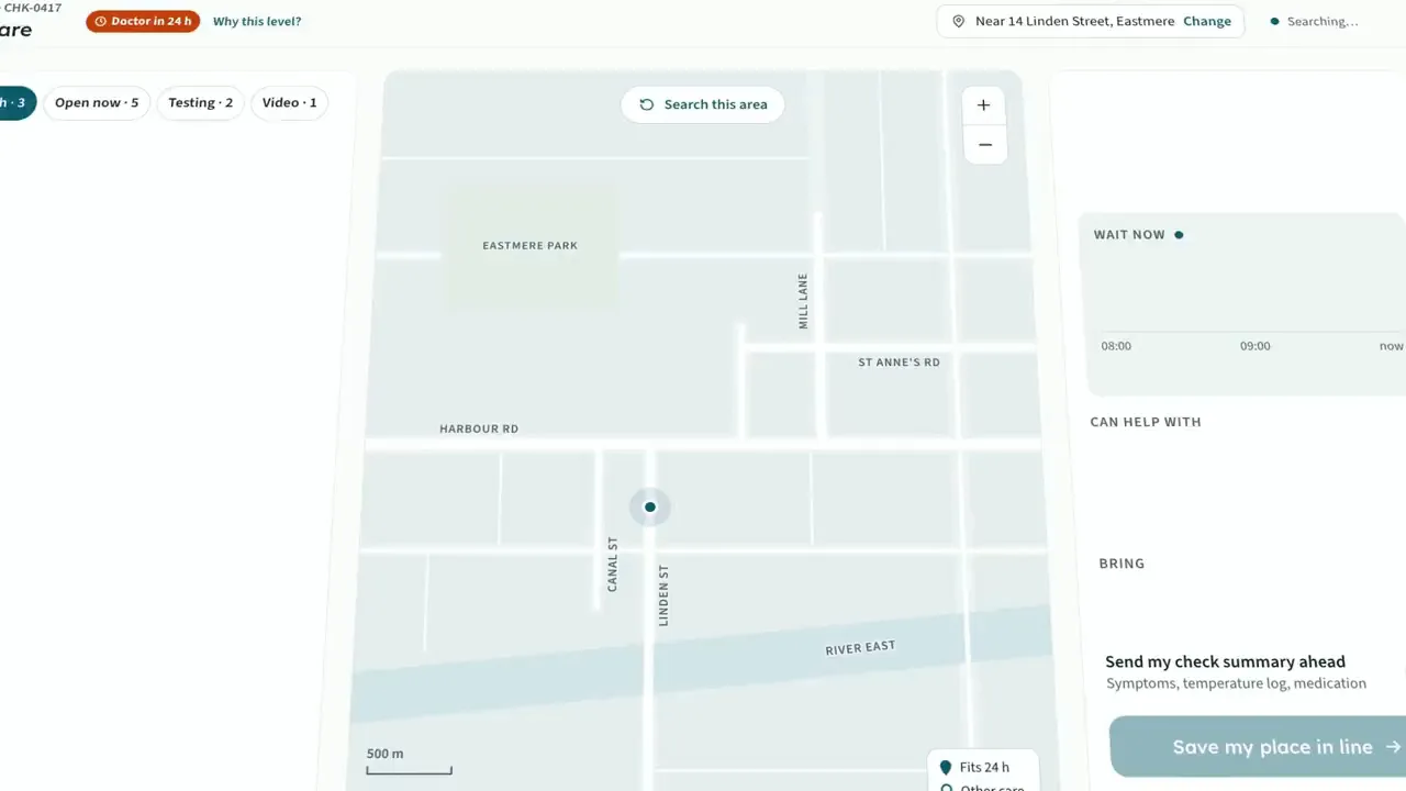
Step 3: Care
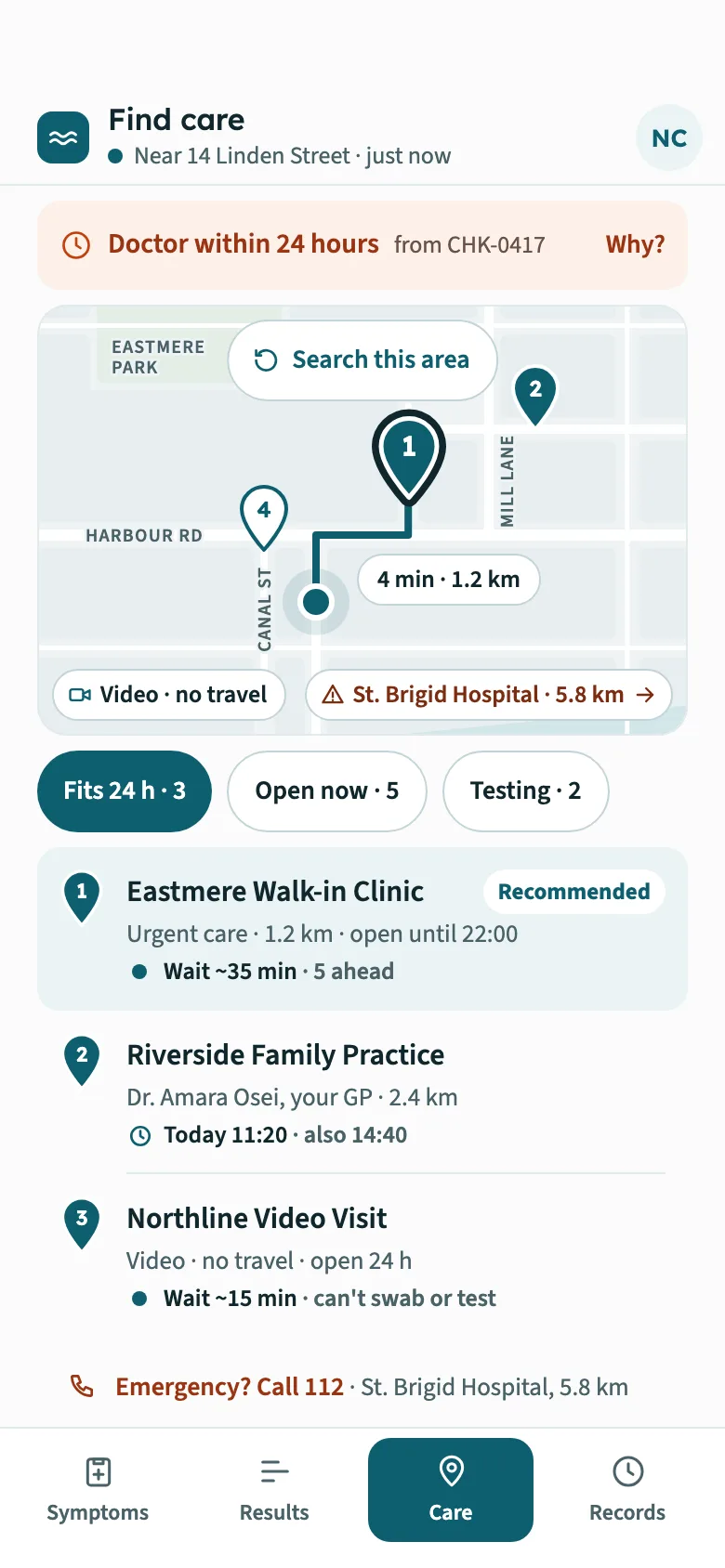
Care is matched to the urgency. The map pins what is nearby — a walk-in clinic, your GP's next free slot, a video visit, a pharmacy — draws the route to the best fit and keeps the waits current. The emergency department stays on the list, marked for emergencies only, next to a button that calls 112.
Step 4: Records
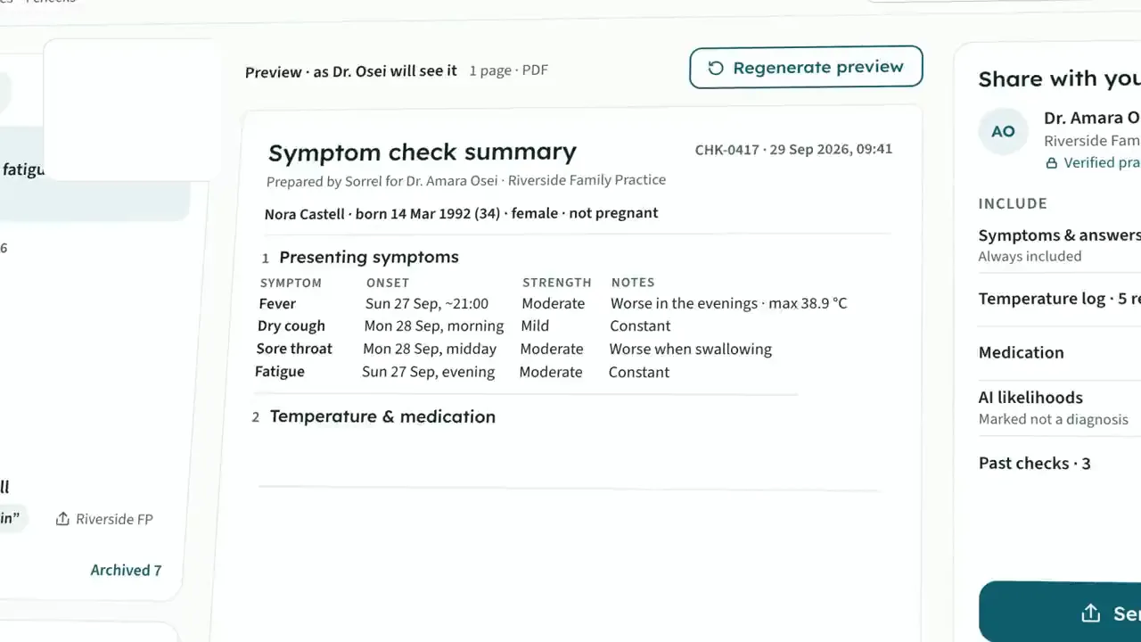
Each check is saved to the family's records. Sorrel sets out a one-page summary for your GP — symptoms, temperature log, medication, the emergency check, and the likelihoods marked not a diagnosis — and you switch sections on or off. It goes to the practice's verified inbox, never a public link, and you see when it is sent, delivered, opened and filed.
FIG. 03 / SCREENS
The product, screen by screen
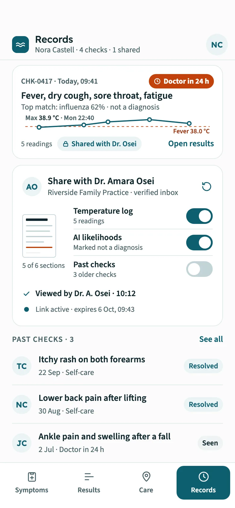
Web app
The same account at a desk, showing what the phone keeps short: the details of each symptom and the full emergency check, the evidence behind every likelihood, the whole map with wait history, and the GP summary exactly as the practice receives it.
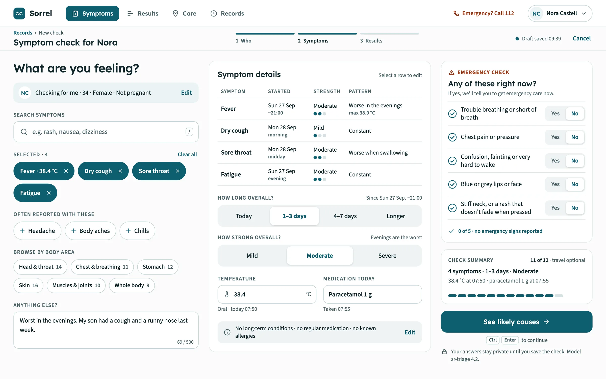
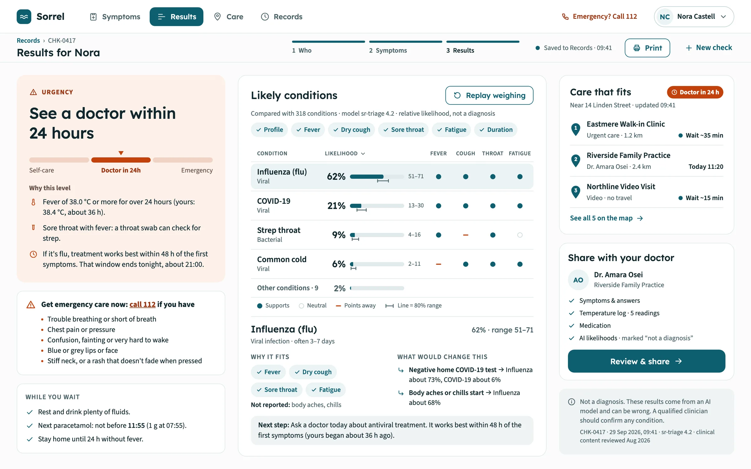
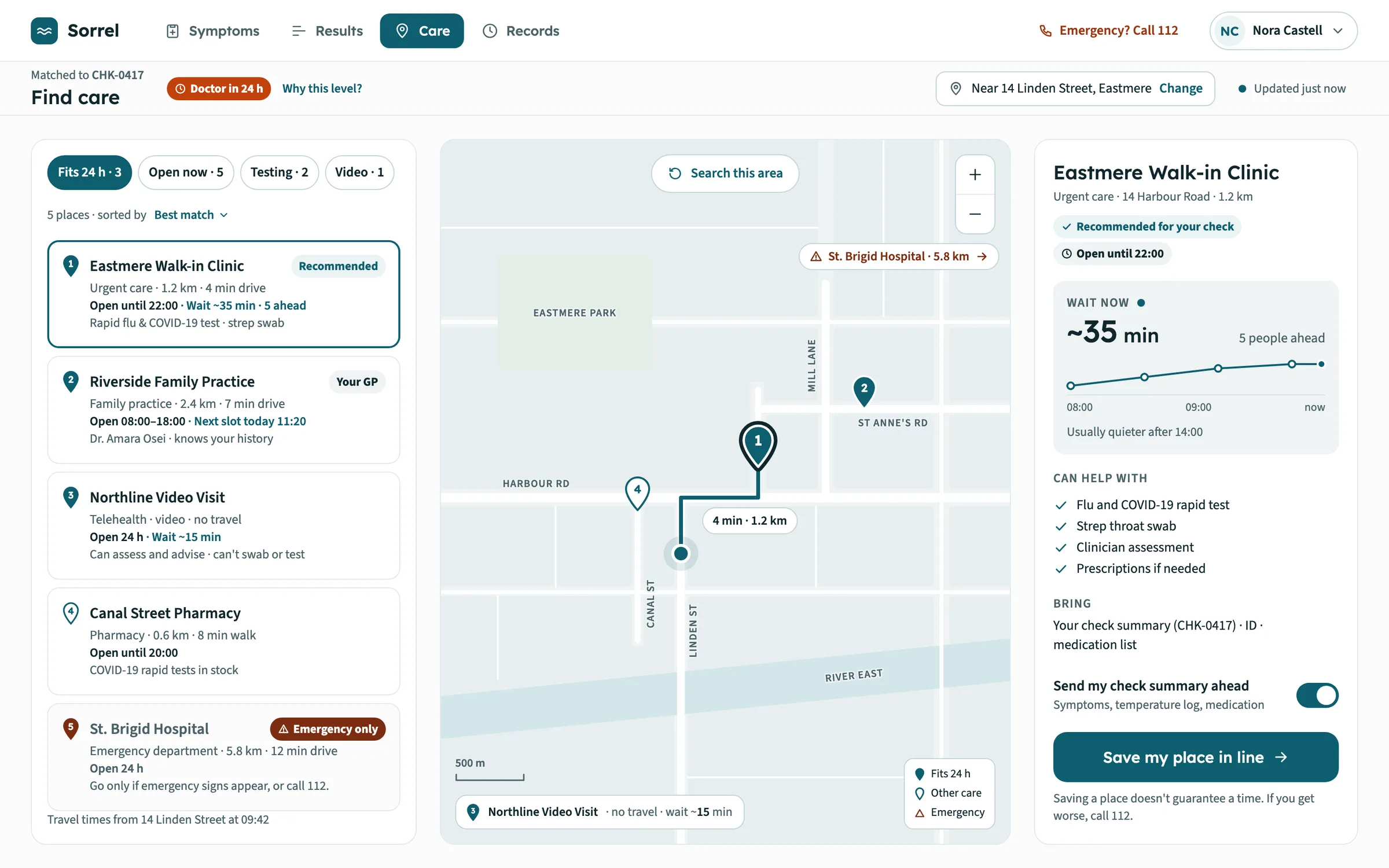
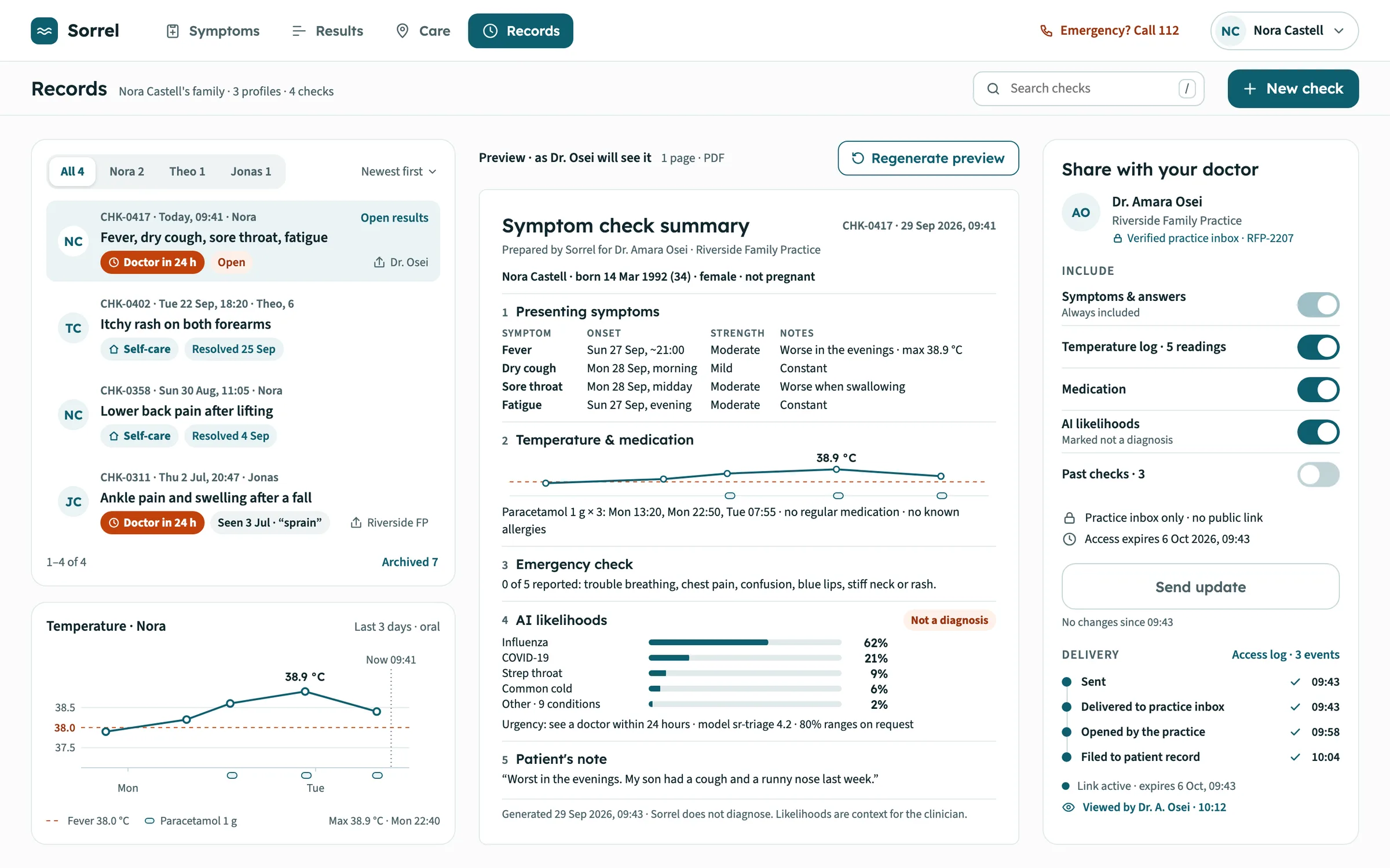
FIG. 04 / DESIGN DIRECTION
Design direction
Calm and clinical, never alarming: an off-white page, white cards with hairline borders, one deep teal for actions and selected states, and a coral kept only for urgency, with a darker red-brown reserved for emergency. The urgency tiers differ in lightness as well as colour, so they never rely on hue alone. Lexend sets headings, numbers and percentages; Source Sans 3 carries everything else. No gradients, no glow, almost no shadows, and no medical cross, heart or pill anywhere — the logo is two wave strokes on a teal tile.
Palette
- Page#FBFCFC
- Ink#10262C
- Teal#0E5E6F
- Urgency coral#C2410C
- Emergency#7C2D12
Type
- Lexend
- Wordmark, headings, numbers, percentages, buttons
- Source Sans 3
- Everything else: questions, answers, labels, fine print
FIG. 05 / MOTION LANGUAGE
Motion language
“Weigh & settle”: Sorrel listens, weighs each piece of evidence and settles on one calm next step, and the motion shows exactly that. Symptoms are placed into a tray, the emergency questions are ticked off one by one, each answer nudges the likelihood bars until the ranking resolves once, in view, and the urgency marker slides and settles on its tier. Care options are pinned on the map and a route is drawn; the GP summary is set line by line before it is sent. Nothing bounces, flashes or glows, and once a screen has settled, only a real change — a new wait, a delivery update — moves, once.
Related systems
Kiko
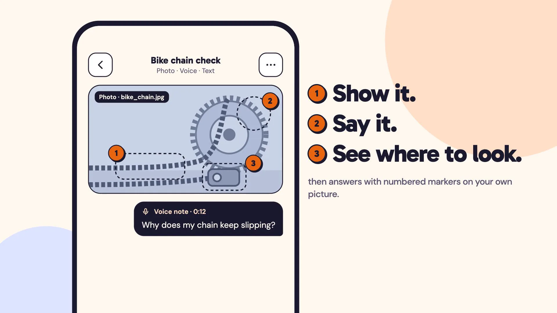
LiveA multimodal AI assistant you can show things to: a photo, a voice note and a line of text in one ask, answered with numbered markers on your own picture.
Mailsort
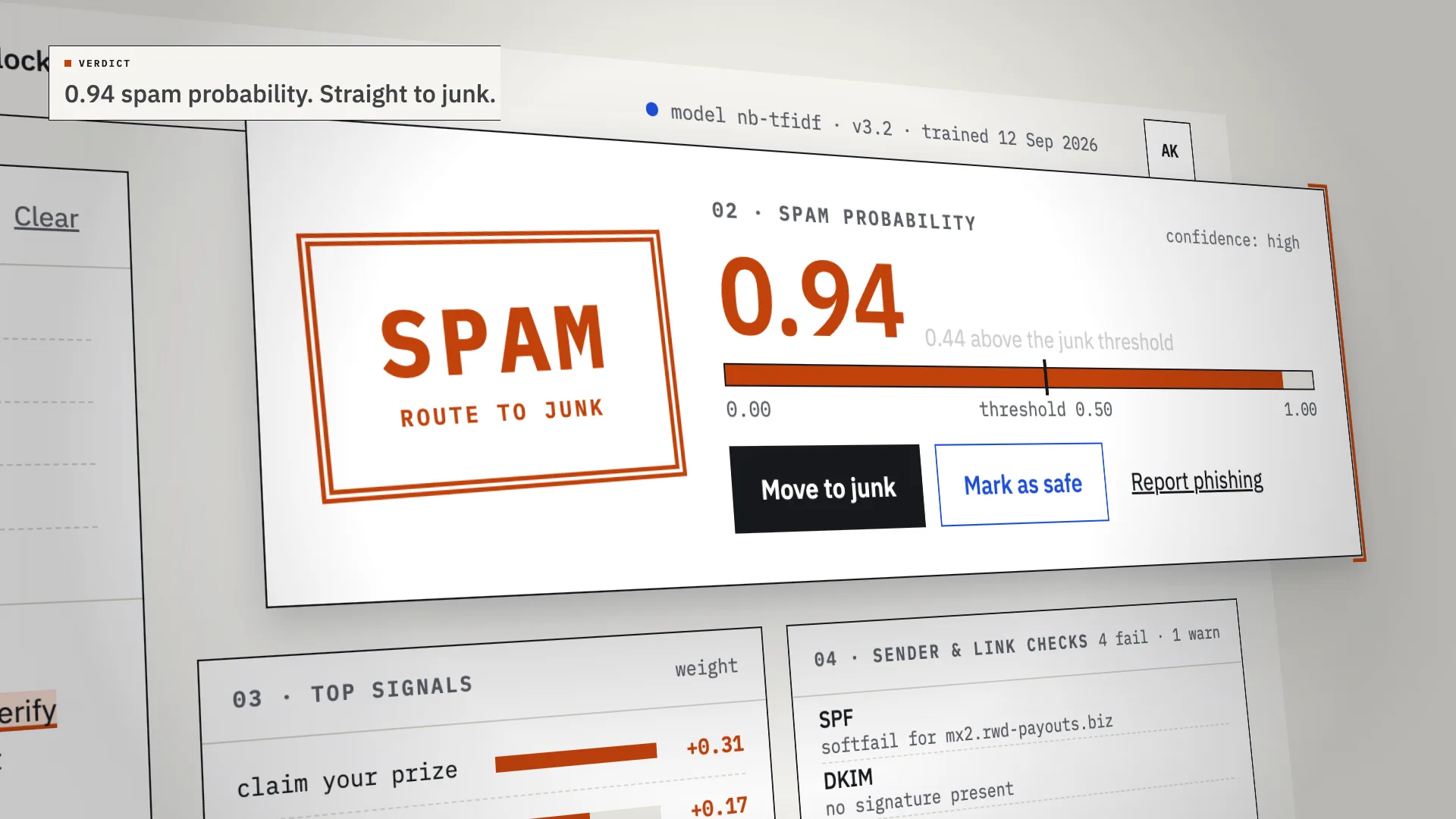
LiveAn AI spam classifier that shows its work: every verdict comes with the phrases, sender checks and links that decided it.
Chalkline
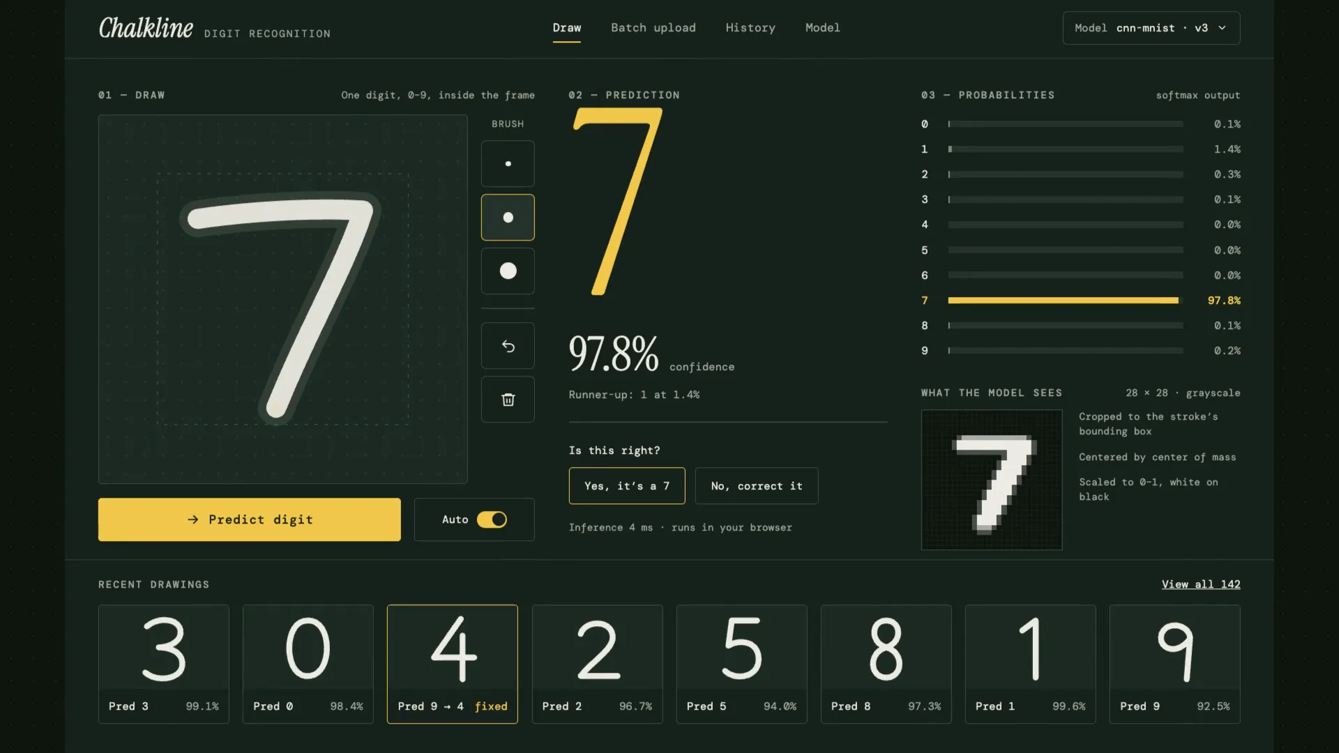
LiveA handwritten digit recognizer that shows its reasoning: your chalk stroke becomes the 28×28 pixels the model sees, then ten probabilities, then an answer.
Have a project like this?
Tell me what you want to build. We map it on a 30-minute call.